Bipi
Bipi, often referred to as the Netflix of car rentals, operates on a subscription-based model, allowing clients to seamlessly rent their preferred vehicle for a specific duration. The service goes beyond mere vehicle access, offering users comprehensive coverage, including insurance, roadside assistance, crash management, and general maintenance.
Project: Maintenance of vehicles - Check in & Check out.
In the Logistics squad, the product trio, in collaboration with the customer success team, identified a significant challenge in the vehicle return process. Clients consistently expressed dissatisfaction with communication gaps, overall process handling, and the absence of adequate documentation for returned vehicles. This absence left clients vulnerable to potential fines, damages, or disputes without supporting evidence.
As the Product Designer within this trio, working alongside a Product Manager and a Tech Lead, I played a crucial role in the project. My contributions included shaping the feature's definition, narrowing its scope, and validating the platform. The outcome was a remarkable reduction in customer complaints related to the return process, enhancing the overall experience for our clients.
Problem: Users lack information about the vehicle return process.
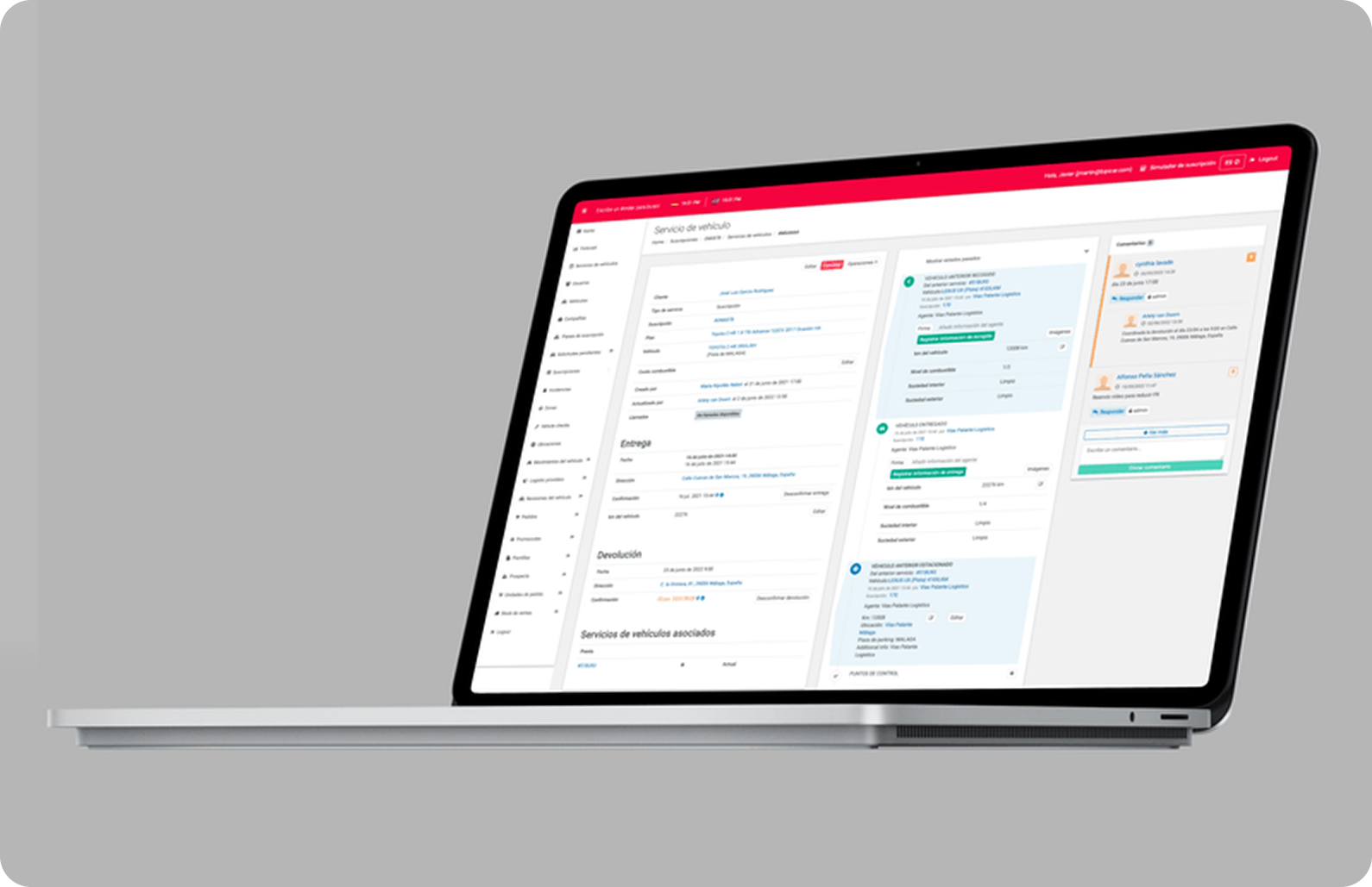
Upon receiving the issue from the customer success team, we analyzed user feedback collected through a campaign. Users consistently reported a lack of information during the vehicle return process, noting the absence of vouchers or documentation reflecting the vehicle's status. To address this, we strategically considered the three platforms in use—the internal logistics mobile web app, the backoffice tool, and the client-oriented front.
Additionally, we drew parallels with a similar process, the vehicle pickup at the early stages of the subscription, to ensure cohesive and effective information handling.
Goal: Create a user-friendly experience that ensures updated and transparent information sharing between the business and clients during both vehicle pickup and drop-off processes.
In addition to the primary goal, our aim was to introduce agility to this process. Given the ongoing complete redesign of the backoffice tool, which couldn't be addressed simultaneously, our focus was on creating a seamless experience. We strategically examined the existing process, identifying key areas where we could enhance business value through mobile information.
Two pivotal stages emerged – the vehicle delivery and return. At both points, our objective was to monitor the overall vehicle status and generate reports for both internal use and client visibility.
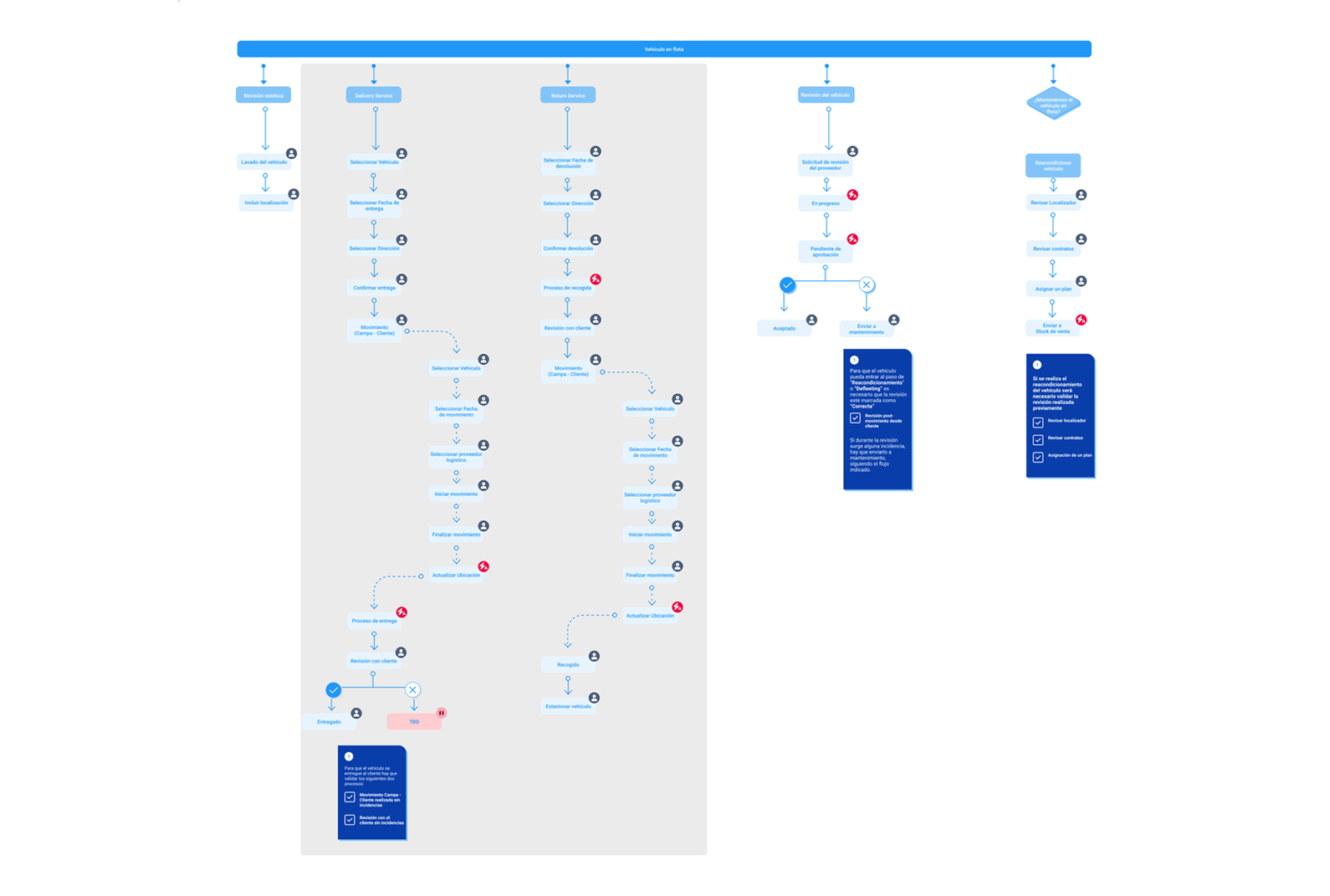
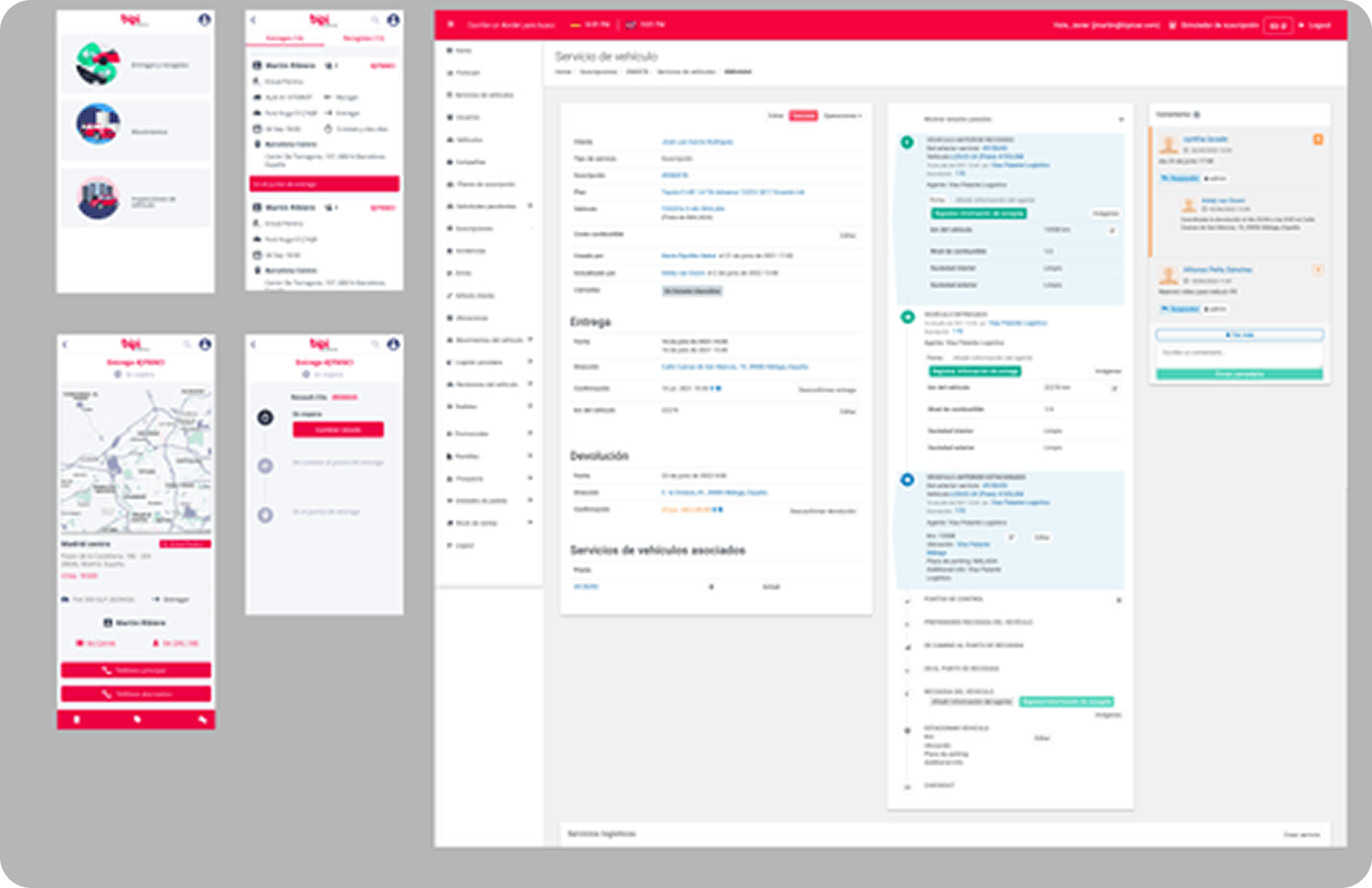
Upon identifying the two primary flows, we convened a meeting to outline the desired format for displaying information and pinpoint the specific sections across our platforms where these additions would be integrated. Leveraging existing features, we directly transitioned into high-fidelity designs, utilizing pre-established components.
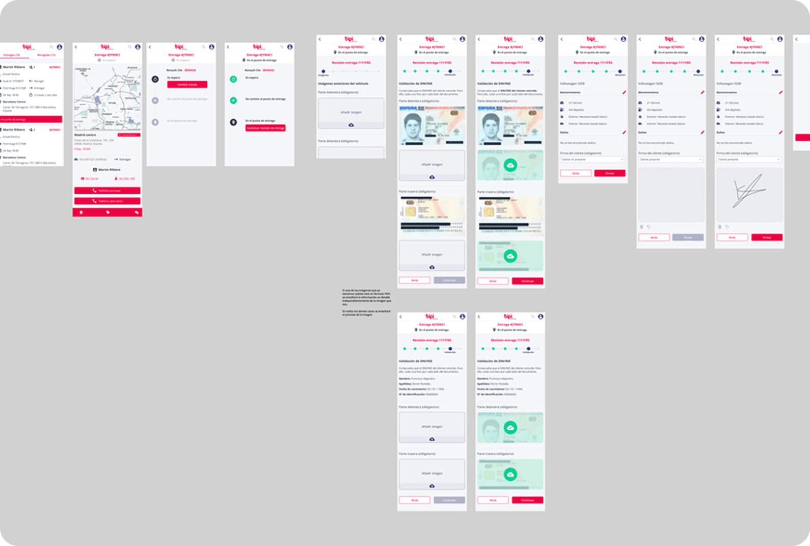
Simultaneously, we refined our delivery validation process by introducing an additional step to authenticate the user's identity and collect a signature. This crucial enhancement occurred seamlessly in both the backoffice tool and the mobile web app, ensuring the validity of the information presented in the generated document.
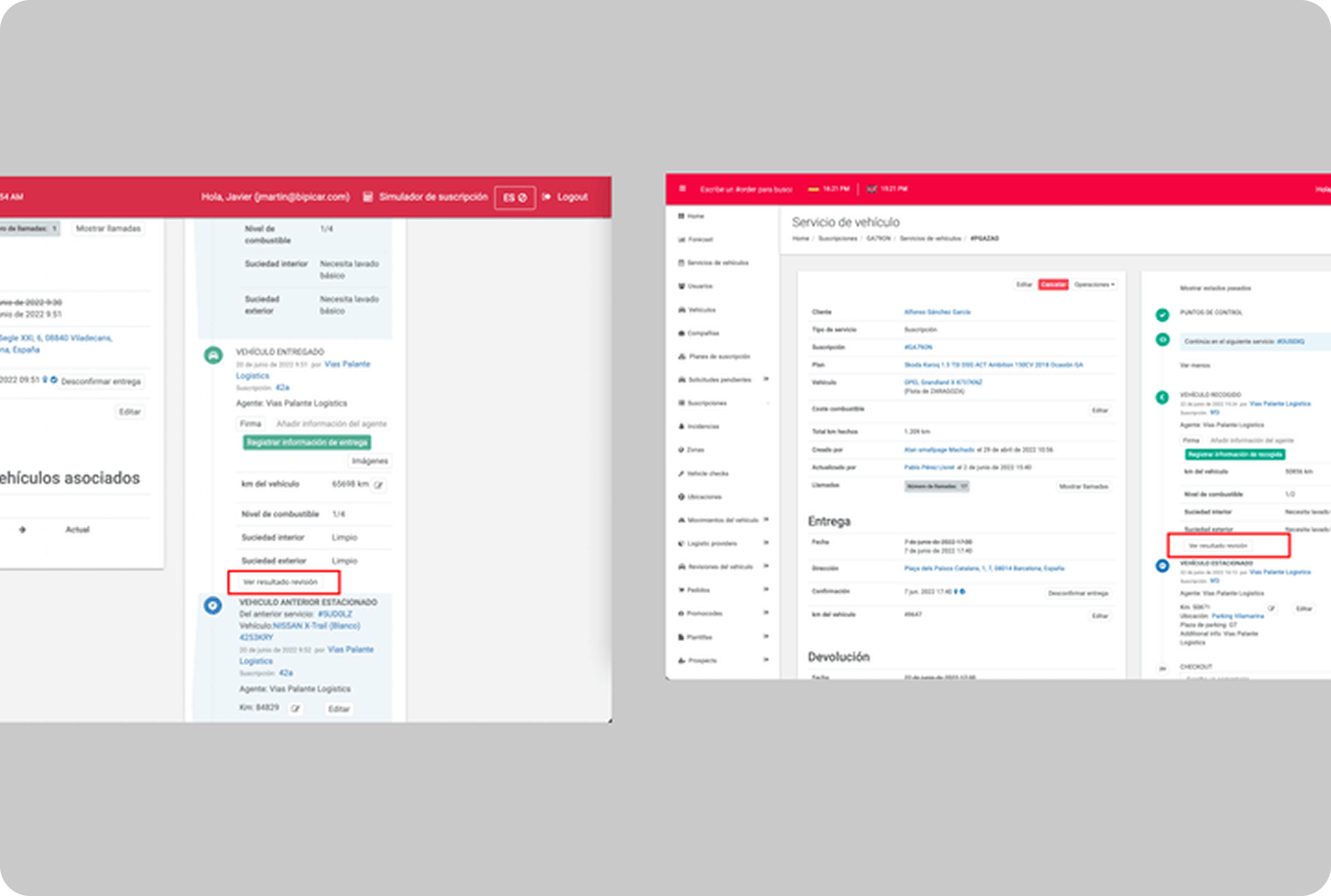
Access to Figma PrototypeThe information collected in this process was effectively presented in the backoffice tool, enabling any internal Bipi employee to review the outcome of the delivery or pickup. To facilitate this, we incorporated a button into the existing timeline, allowing for the download of the same PDF file provided to the customer.
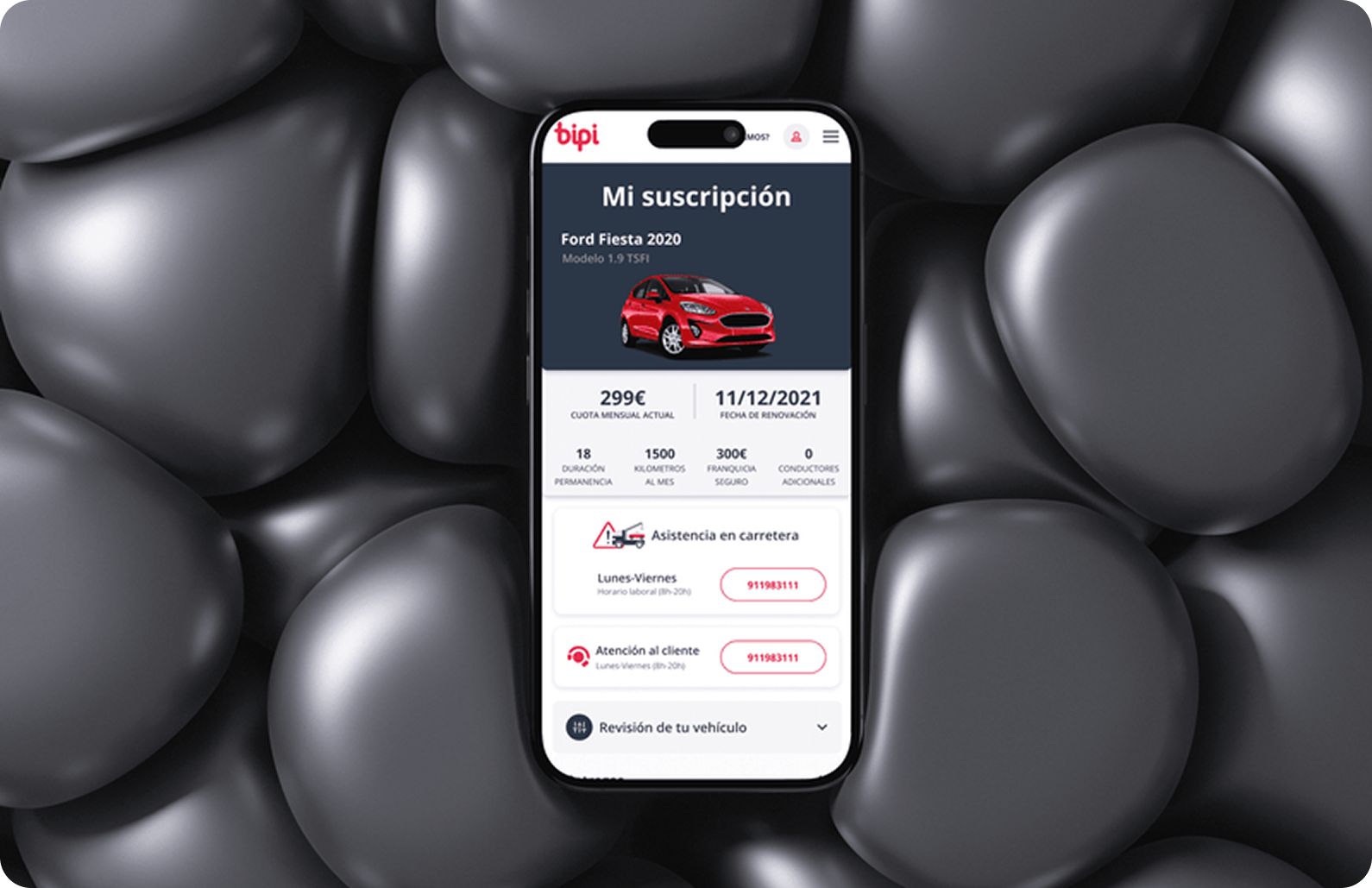
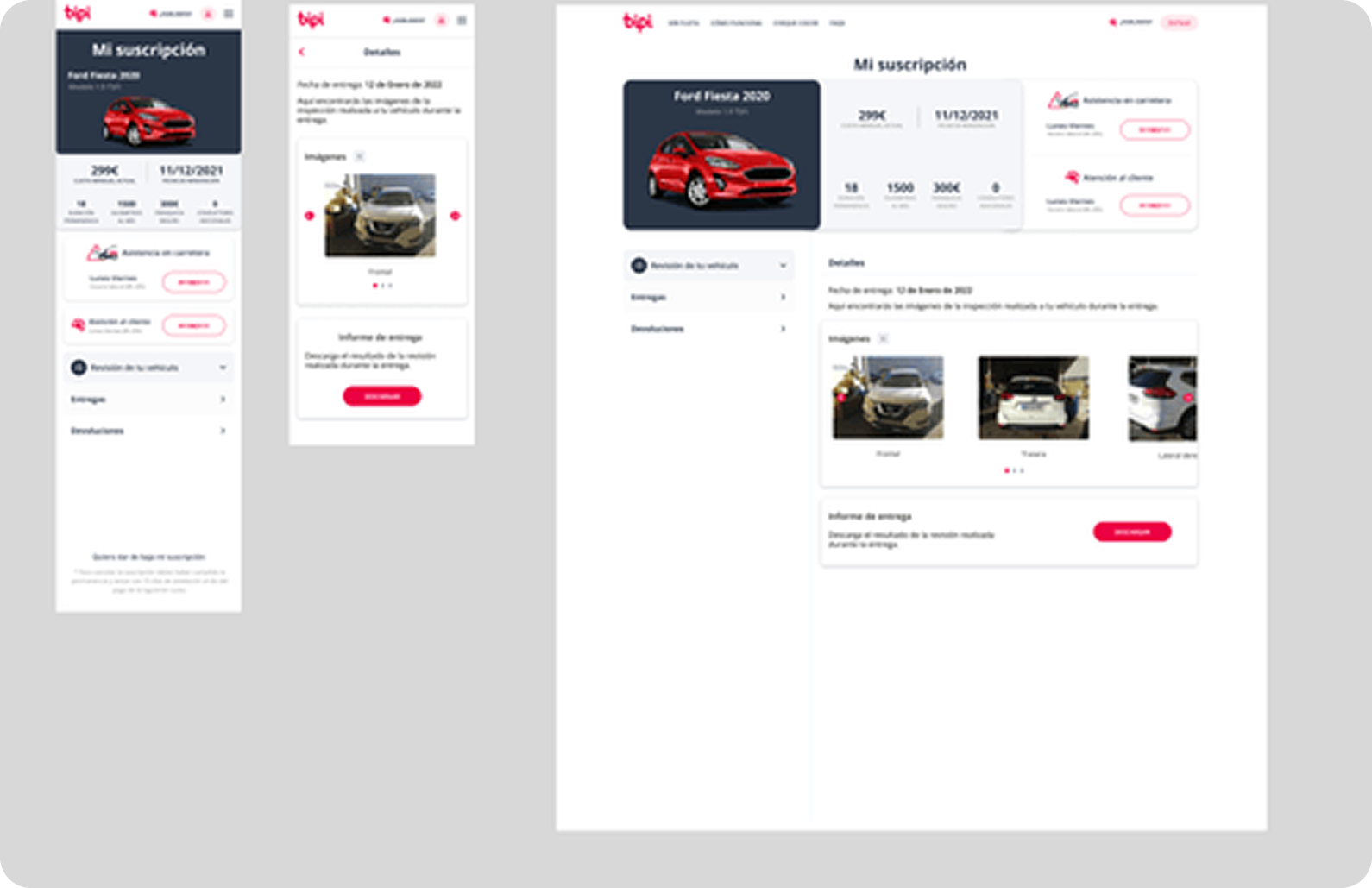
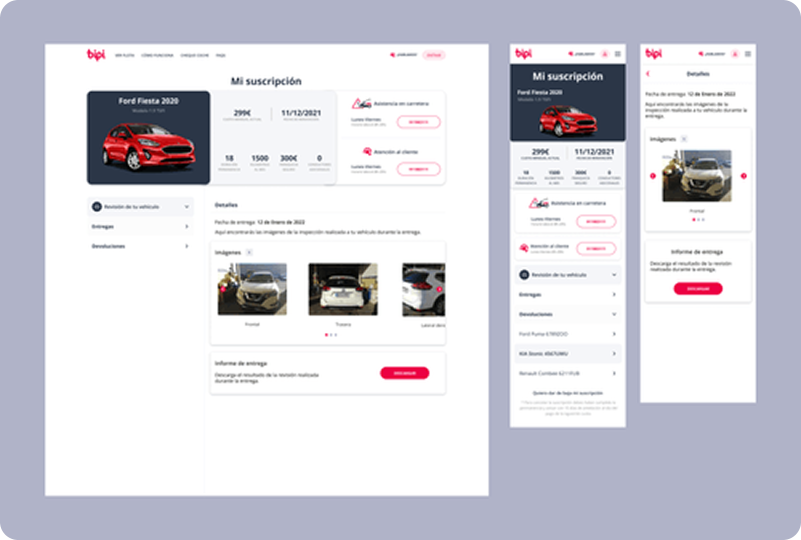
Clients were given a new section in their profiles, enabling them to review all deliveries and pickups conducted throughout their usage of Bipi's services. This section included a compact image preview and the specific time of each activity. For in-depth insights into the vehicle's handling, clients had the option to download a comprehensive PDF file containing all the gathered information.
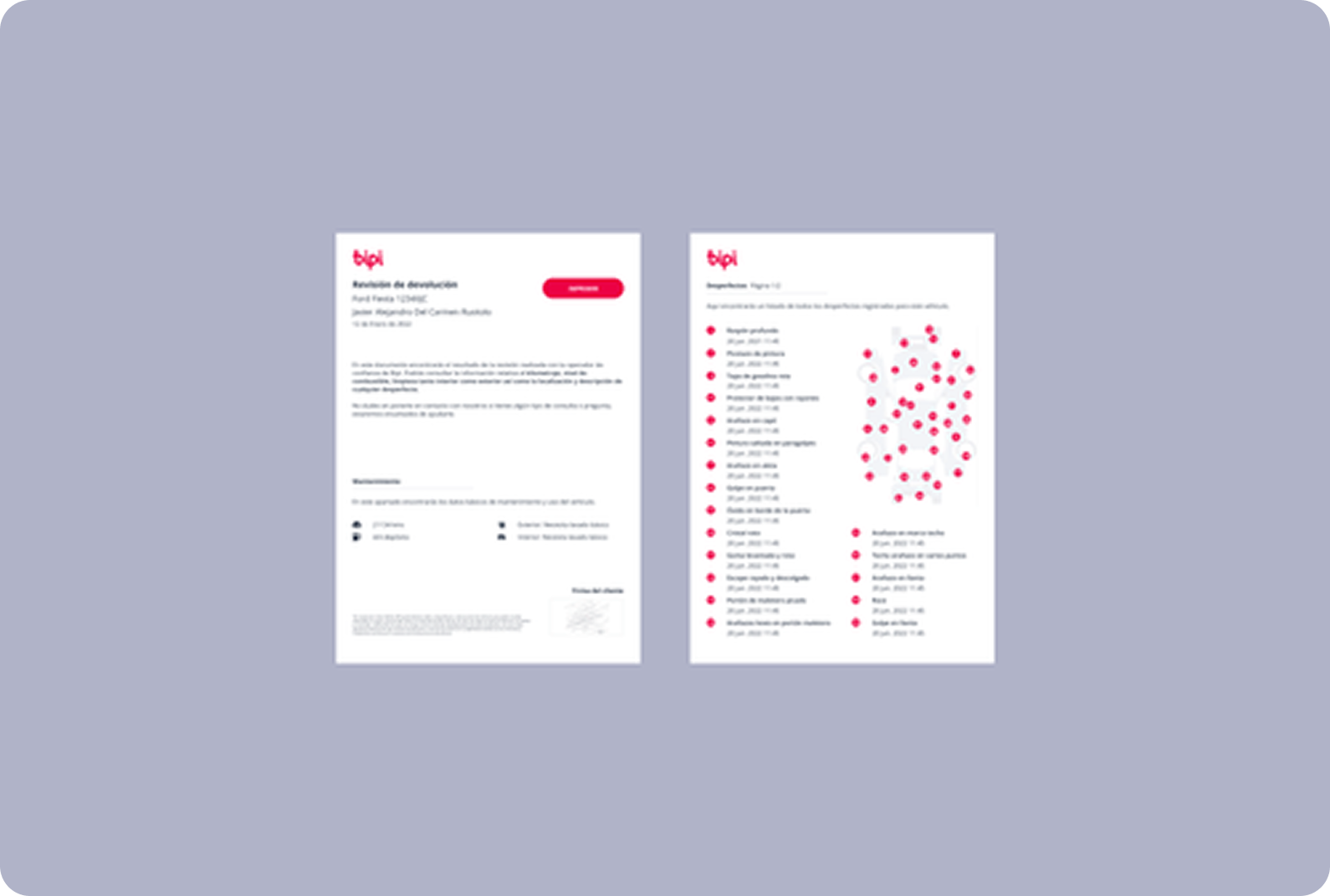
Result: Achieved a substantial reduction in customer complaints and successfully reduced dispute handling time by two days.
Following the feature launch, the customer success team observed a significant decrease in customer complaints related to information display for pickups and deliveries. In the initial month post-release, requests for additional documents with supplementary information were minimal, primarily from users who had not explored the new section in their private profiles.
Notably, clients involved in disputes experienced a notable 2-day reduction in resolution time (from 5 days to 3 days). Users frequently found the required information or opted not to pursue further actions after accessing the displayed information.
Future steps: Iterate the Backoffice.
A significant challenge as a designer during the development of this feature was the information overload on the front end of the backoffice. Given our ongoing backoffice redesign, compromises were made to facilitate the feature launch, recognizing that addressing this issue would be a future endeavor.
Immediate next steps involve enhancing the user experience in this platform, as internal users expressed dissatisfaction with the current information display and interaction methods. Depending on gathered data, a revision of the mobile application is also planned, streamlining the process and improving the digestibility of information clusters for operations users.
Reflection: 360º overview, compromise.
Throughout the development process, I personally encountered the challenge of presenting a substantial amount of complex information across diverse platforms with vastly different objectives. This experience as a designer provided valuable insights into the intricate challenges faced by the development team in organizing various databases and establishing communications with different endpoints.
The collaborative effort was truly remarkable, requiring all team members to make compromises for the sake of a shared goal, showcasing the strength of teamwork in overcoming challenges.